


Published 2021
rebranding,graphic,typeface
來自花蓮健康餐盒品牌,創辦人本身有健身習慣,除了定期運動外他認為飲食搭配也很重要。五年前健康飲食在花蓮並不盛行,因此才有創立健康餐盒品牌的想法。
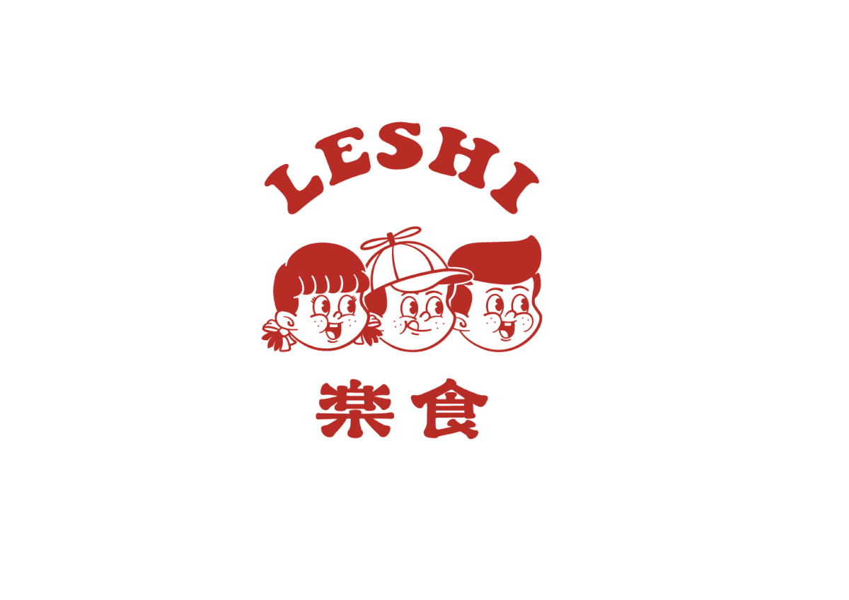
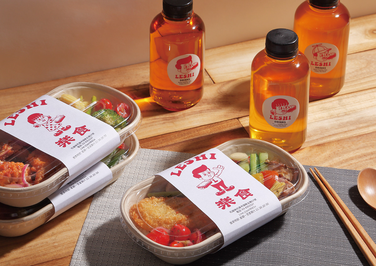
此次品牌重整希望讓品牌整體更年輕,並將三個夥伴一起融入商標中;品牌色以能促進食慾的紅色為主色,餐盒腰封分別使用三個角色去搭配,消費者每次訂餐就能猜想或期待,今天拿到的角色是哪一個。
此次品牌重整希望讓品牌整體更年輕,並將三個夥伴一起融入商標中;品牌色以能促進食慾的紅色為主色,餐盒腰封分別使用三個角色去搭配,消費者每次訂餐就能猜想或期待,今天拿到的角色是哪一個。
LESHI is a healthy lunch box brand from Hualien, the founder has fitness habit, in addition to regular exercise, and she believes that diet is also important. Five years ago, healthy eating was not popular in Hualien, so the idea of creating a healthy lunch box brand was born.
The brand reorganization hopes to make the brand younger, and integrate the three partners into the trademark together; the main brand color is red, which can promote appetite, and the lunch box package uses three roles to design. When ordering a meal, you can guess or look forward to which role you will get today.
Designer 鄭啟宏
Photography 周政毅


